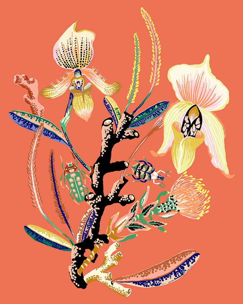
I was immediately taken by Sarah Gordon’s work. I was drawn in by her animal, insect, and nature-based imagery, reminiscent of antique botanical illustrations but with her own quirky and kicky color and spin. UK-born and Bainbridge Island-based, Sarah’s illustrative work has been featured in a major contemporary art show at the Royal Albert Memorial Museum. Her work was recently featured by The Jealous Curator. 👏🏻
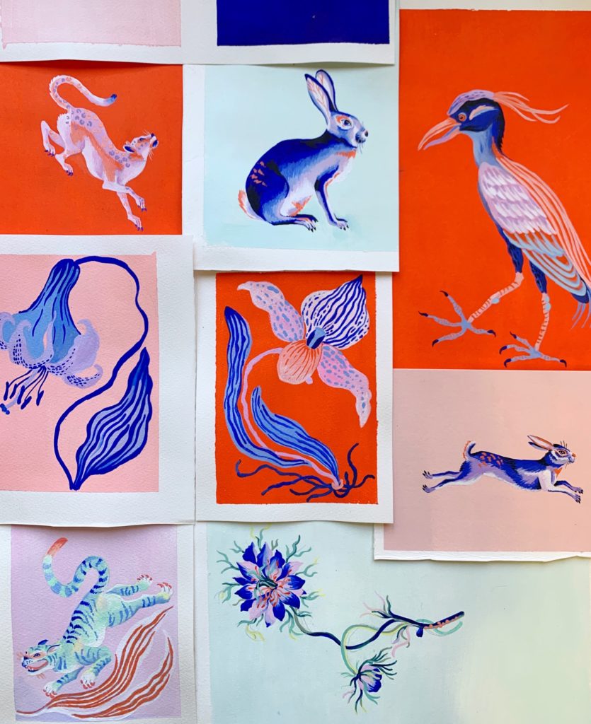
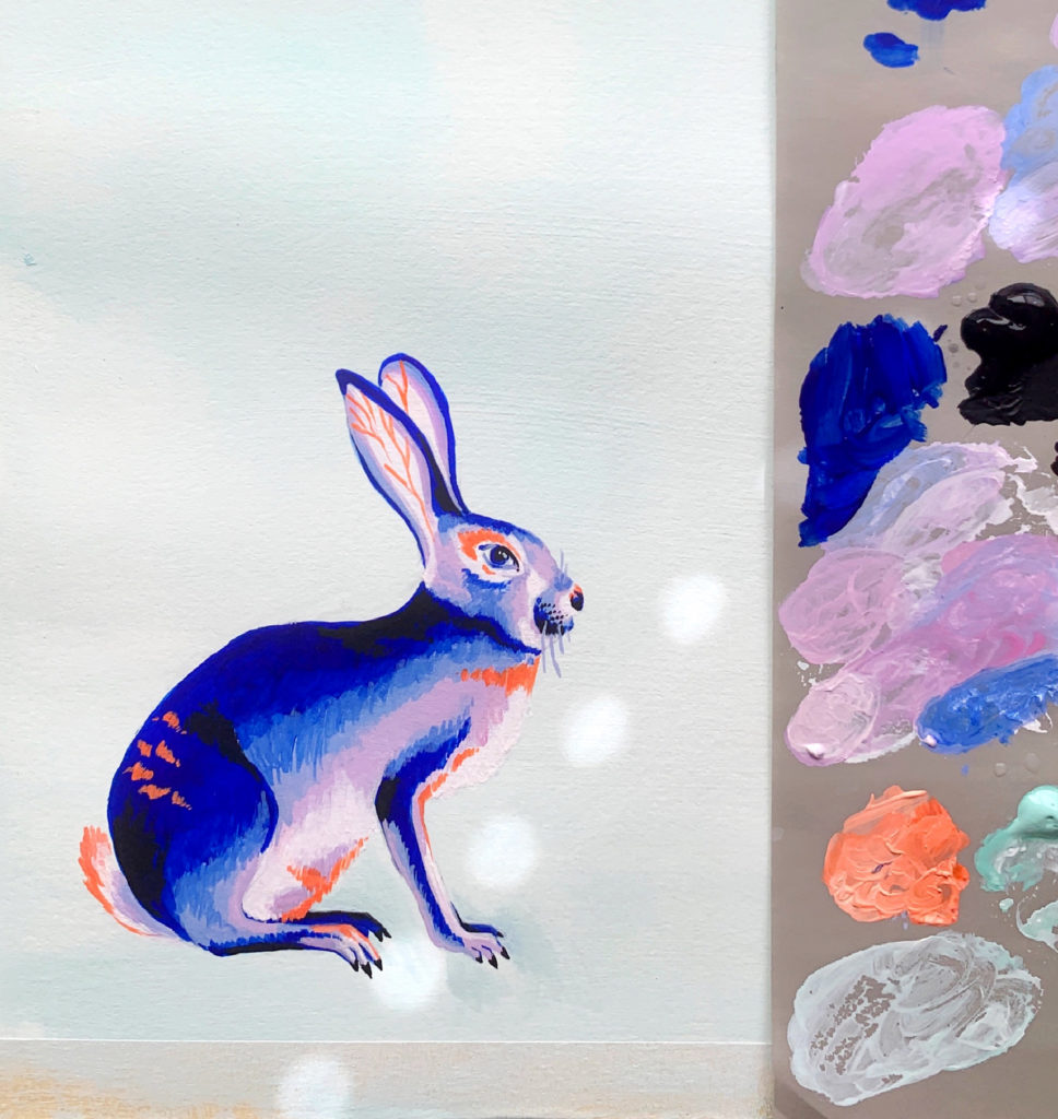
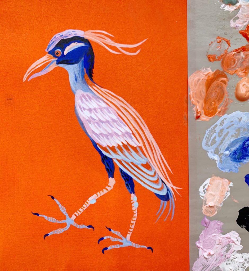
We have Sarah’s prints in the Niche Market (popular!) and will feature her artwork in a group show, HUMAN/ANIMAL, in March 2022. Very excited to see what she comes up with! (A few hints below.)
How did you get your start in textile design?
I did a BA Hons degree in Fashion Textile Design at University of Brighton, UK. After graduating I moved to NYC for a position with a textile studio designing prints for the fashion industry. From there I worked for various companies both freelance and inhouse before setting up my own textile studio with three design friends as partners. We designed seasonal collections for a range of companies from mass market to high end for about 12 years and I learned so much about design and the textile market during that time.
When did you decide to also start making artist prints?
About 4 years ago after I had my second son, I decided to make the move from the commercial textile world to pursue my own art practice. I loved running a textile studio, but it came with a lot of stress and challenges and I wanted to slow down and focus on being creative plus have more time for my family. I spent a good year or so when my son was a baby just painting and exploring ideas and gradually found my own artistic identity and direction. I’ve always been greatly inspired by interiors and architecture in general and it felt like a natural progression to produce an art print collection for interiors. I’ve been so happy with the response to the collection!
You seem to have a lot of fun with your color choices. When did you develop your distinctive palette?
Working in textile design has given me so much insight with colour palettes and seasonal colour trends. I even worked as a colorist for a while with a fashion company where I was responsible for colour correcting and approving every fabric swatch or yarn dye from the mills by eye. All professional experience has been invaluable.
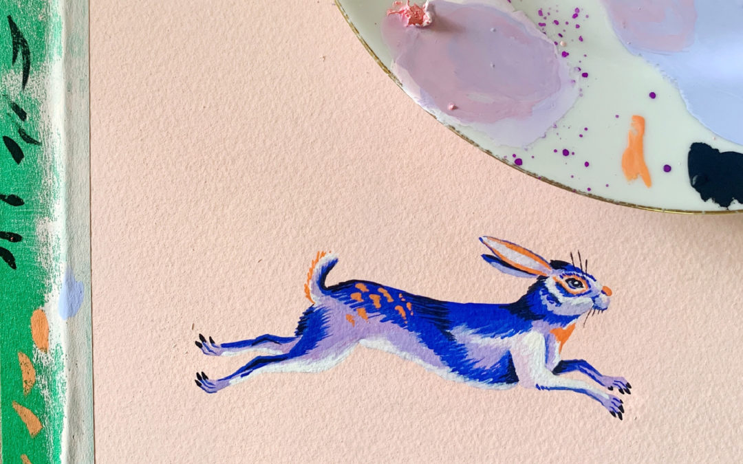
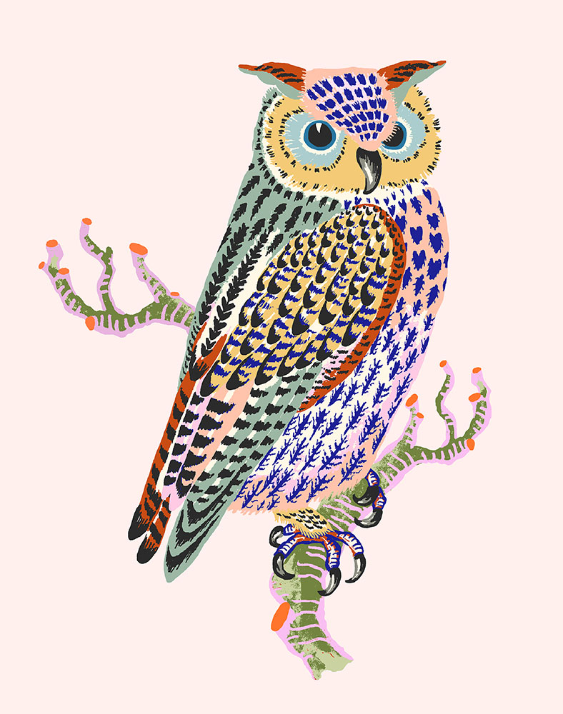
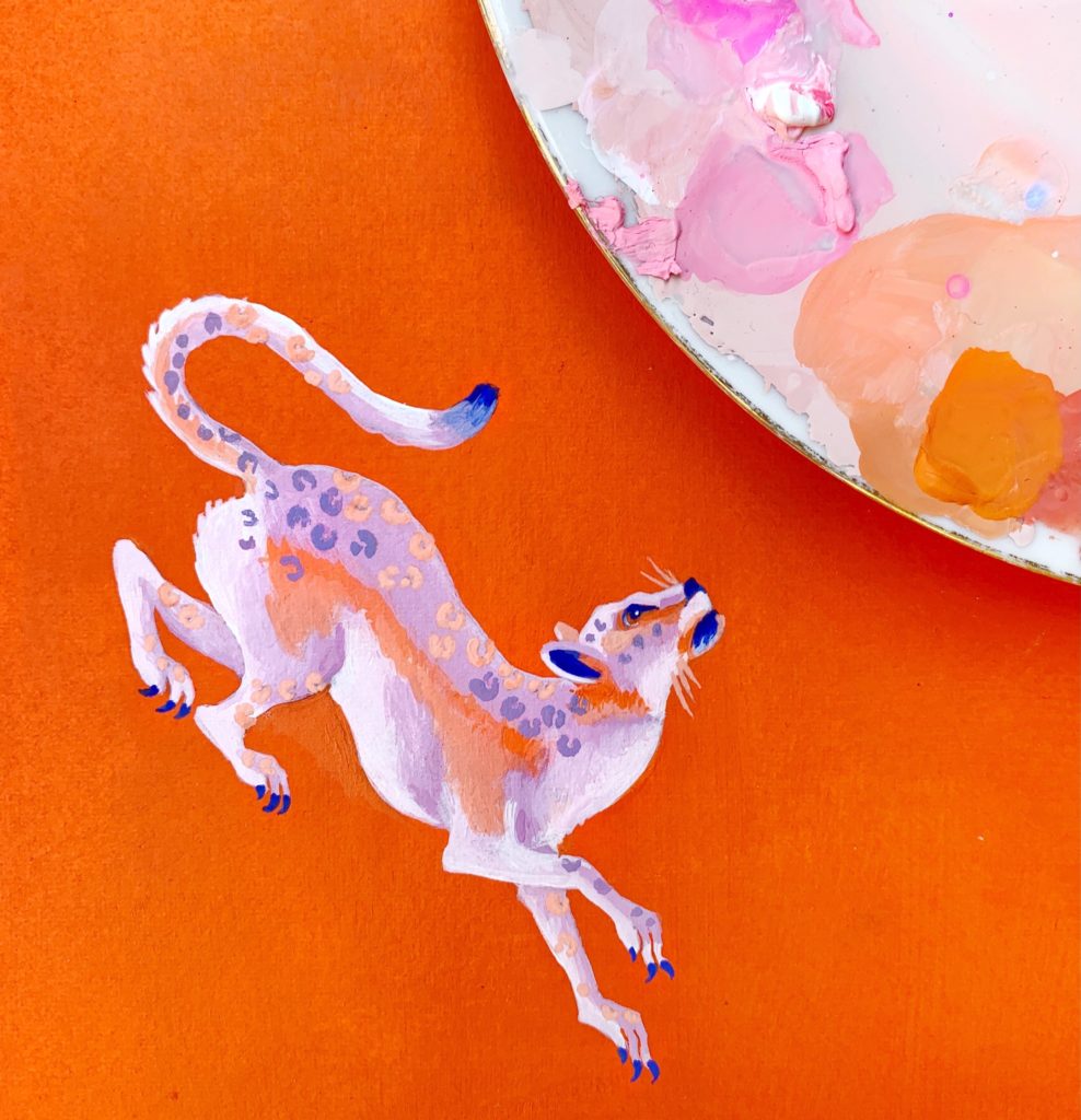
The use of colour is such an integral part of my artistic process and I sometimes think of it as my superpower. Often I’ll develop a colour palette before I even decide on the imagery I want to paint and the colour palette ends up influencing the actual subject matter. I’ve always been drawn to certain colours and combinations – in particular playing with contrasting and vibrating colours. I love to add in unexpected accents of colour such as acidic yellows and pinks.
Your sea and flora and fauna motifs are lovely. What drew you to that imagery?
I went from many years of city life in NYC to then living on a small island in the Puget Sound surrounded by nature and sea life. I live two blocks from our local beach and spend a lot of time walking every day and observing nature with my four-year-old. Walking at a slow toddler pace I started to become hyper aware of daily seasonal changes and have been particularly drawn to all the natural imperfections and unnoticed details such as tangled stems or delicate markings and patterns from decay.
What’s something about you or your work that no one would know by looking but is essential to your practice?
On the surface the imagery in my artwork may look organic and closely representative of nature, but I have always been inspired by the boldness of modern art and digital techniques. For most of my textile career I have designed by hand painting and then transferring those paintings into digital imagery. The process of separating and flattening colour tones into workable colour palettes for fabric printing also informs how I observe and paint natural subjects. For example, when I study a flower or leaf, I will automatically break it down into flat contrasting planes of colour which is where my use of patterning and colour often comes from.
You’ll be showing unique work with AMcE next year. Any sneak peeks, visually or otherwise?
I am so excited to be showing with the AMcE and have been really inspired by the theme of the show, HUMAN/ANIMAL. I’m exploring the anthropomorphic connection between humans and animals by portraying human characteristics and emotions through colour and subtle symbolism. I’m also playing with negative space and how the animal moves within the confines of a square canvas.
Recent Comments